Relying on width or border-bottom properties for hover effects triggers expensive layout recalculations that drop your frame rate well below 60 FPS. Switch to transform: scaleX on a pseudo-element and the browser hands that work to the GPU entirely.
- Performance Target: 60 FPS (GPU Accelerated)
- Single-Line Text:
transform: scaleX - Multi-Line Text:
background-size - Modern Native Method:
text-decoration-thickness - Accessibility Fix:
prefers-reduced-motion
Why Transform Beats Width for Underline Animations
Animating the width property forces the browser to recalculate the geometry of the entire page on every single frame. This layout thrashing creates visible stuttering and lag, especially on mobile devices with limited processing power. Changing physical dimensions is computationally expensive.
Using transform pushes the animation work directly to the GPU. The main thread remains entirely free. Rendering stays crisp, and you get a guaranteed 60 FPS animation because the browser only manipulates the visual representation of the element, not its actual physical space.
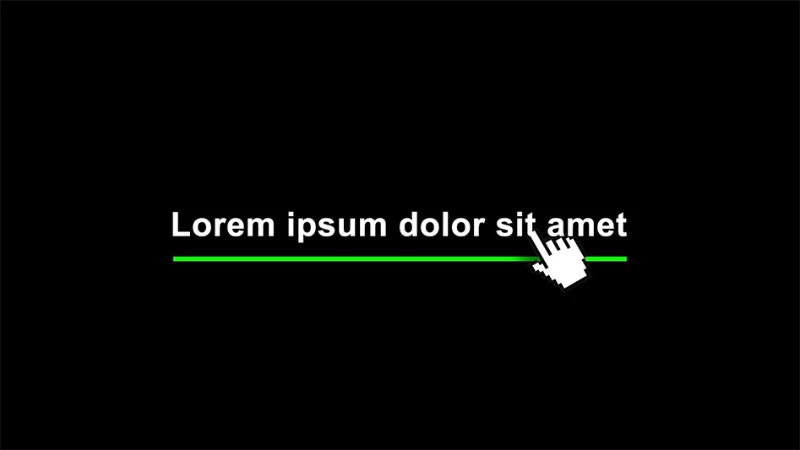
The ScaleX Technique for Single-Line Text
Creating a pseudo-element and scaling it horizontally is the industry standard for single-line hover states. You need an absolutely positioned ::after element sitting right below your text block.
Center-Out Expanding Line
Set transform-origin to center to make the line grow outward from the middle. The visual balance is perfect for primary navigation menus.
<a href="#" class="underline-center">Our Services</a>
.underline-center {
  position: relative;
  display: inline-block;
  text-decoration: none;
  padding-bottom: 4px;
}

.underline-center::after {
  content: '';
  position: absolute;
  width: 100%;
  height: 2px;
  bottom: 0;
  left: 0;
  background-color: currentColor;
  transform: scaleX(0);
  transform-origin: center;
  transition: transform 0.3s ease-out;
}

.underline-center:hover::after,
.underline-center:focus-visible::after {
  transform: scaleX(1);
}
Bi-Directional Wipe Effect
Manipulating transform-origin during the hover state creates a sleek directional wipe. The line slides in smoothly from the left and exits to the right when the cursor leaves.
.underline-wipe::after {
  content: '';
  position: absolute;
  width: 100%;
  height: 2px;
  bottom: 0;
  left: 0;
  background-color: currentColor;
  transform: scaleX(0);
  transform-origin: bottom right;
  transition: transform 0.3s ease-out;
}

.underline-wipe:hover::after,
.underline-wipe:focus-visible::after {
  transform: scaleX(1);
  transform-origin: bottom left;
}
The Background-Size Technique for Multi-Line Text
Pseudo-elements fail completely when your text wraps to a second line because they only draw a single rigid box. Linear gradients solve this wrapping problem effortlessly.
<p>
  Using <a href="#" class="underline-multiline">modern CSS animation techniques</a>
  is critically important for user experience.
</p>
.underline-multiline {
  text-decoration: none;
  background-image: linear-gradient(currentColor, currentColor);
  background-position: 0% 100%;
  background-repeat: no-repeat;
  background-size: 0% 2px;
  transition: background-size 0.3s ease-in-out;
}

.underline-multiline:hover,
.underline-multiline:focus-visible {
  background-size: 100% 2px;
}
The underline naturally respects line breaks and wraps perfectly along with your flowing content. You maintain full control over the line thickness and color without breaking the layout. This is the same technique used in many design systems for body copy links.
Modern Alternatives: text-decoration Properties
Using text-underline-offset and text-decoration-thickness
Native text decoration finally offers precise styling control without relying on pseudo-elements. You define the exact pixel gap between the text and the line using text-underline-offset. Transitioning the decoration color or thickness provides a clean visual effect.
.underline-native {
  text-decoration: underline;
  text-decoration-color: transparent;
  text-underline-offset: 4px;
  text-decoration-thickness: 2px;
  transition: text-decoration-color 0.3s ease;
}

.underline-native:hover,
.underline-native:focus-visible {
  text-decoration-color: currentColor;
}
The native method also handles descenders correctly by default , the underline skips over letters like p, g, and y cleanly, without any extra configuration.
Transform vs. Modern CSS: Which One to Choose?
Stick to the transform technique when rendering performance is your absolute priority , it remains the most reliable cross-browser choice for complex animations. Choose native text-decoration properties when you want minimal CSS and the descender-skipping behavior matters for your typography.
Both approaches are compatible with the custom color systems you build in Tailwind CSS v4 , just pass a CSS custom property as the color value.
Essential Accessibility Implementations
Disabling Animations with prefers-reduced-motion
Motion sickness is a real accessibility barrier. Wrap your transition rules inside a @media (prefers-reduced-motion: reduce) query to disable the scaling effect for users who have requested reduced motion. The underline simply appears immediately.
@media (prefers-reduced-motion: reduce) {
  .underline-center::after,
  .underline-wipe::after {
    transition: none;
  }

  .underline-multiline {
    transition: none;
  }
}
One media query. No JavaScript. This satisfies WCAG 2.1 SC 2.3.3 for users who have requested reduced motion at the OS level.
Keyboard Navigation: :focus-visible State
Relying solely on :hover completely locks out users navigating with a keyboard. The examples above already chain :focus-visible alongside hover , this is not optional. Pressing Tab now correctly triggers the animation, providing clear visual feedback for interactive elements without requiring a mouse.
The :focus-visible selector (rather than plain :focus) avoids showing the outline on mouse clicks while still covering keyboard navigation. If you are also building interactive UI components, this same principle applies when you build a search bar with Tailwind CSS or any other focusable element.
Handling Hover States on Mobile Touch Devices
Hover animations often get permanently stuck on touch screens right after a user taps a link. Use @media (hover: hover) to serve the animation only to devices with a precise pointing device.
@media (hover: hover) {
  .underline-center:hover::after {
    transform: scaleX(1);
  }
}
Mobile users get a static, reliable experience without broken interface states.
Troubleshooting Common Underline Animation Bugs
The Underline Covers the Text (z-index Fix)
Forgetting to assign a negative z-index to your pseudo-element makes the solid line cover your text completely. Add z-index: -1 to the ::after block. The text remains readable, and the line drops into the background layer.
.underline-center::after {
  /* ... other properties */
  z-index: -1;
}
The Animation Shifts the Whole Layout (position: relative Fix)
An absolutely positioned pseudo-element flies completely out of bounds if its parent lacks a valid positioning context. Apply position: relative directly to your anchor tag. Without it, the ::after element anchors itself to the nearest positioned ancestor , often the entire page body , which breaks the visual entirely.
The Line Does Not Animate on Multi-Line Links
This is the most common reason to switch from the ::after technique to the background-size method. If your link text wraps, the pseudo-element draws a rectangle around the full block , not along each line. There is no CSS fix for this behavior on pseudo-elements; background-size is the correct tool.
The Future: CSS Houdini Underlines
CSS Houdini APIs are slowly opening up the browser rendering engine to developers. The Paint API allows writing custom JavaScript worklets that draw complex underline shapes with full awareness of text flow. Browser support remains limited, making it an experimental tool rather than a daily production technique. Worth watching as support matures.
Start with transform: scaleX for navigation and buttons. Reach for background-size as soon as your link text can wrap. Add the prefers-reduced-motion block last, and you have covered every real-world use case.