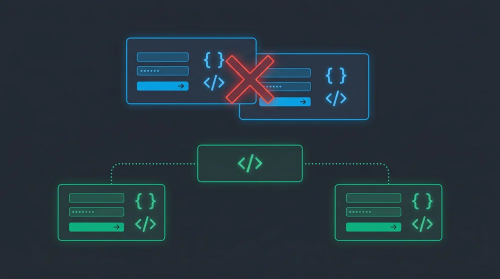
The biggest headache when moving to Tailwind CSS v4 is watching your custom color palette break because the old configuration file is no longer the source of truth. The new CSS-first engine completely rewrites how utility classes are generated. Your standard background utilities will fail unless you master the new variable syntax.
- Required version: Tailwind CSS v4+
- Configuration file:
main.css(replaces the old JavaScript config) - Key directive:
@theme - Arbitrary syntax:
bg-[var(--color-name)]
What Changed with Color Management in Tailwind v4?
Tailwind v4 drops the JavaScript configuration file entirely. You now manage your design system using native CSS variables directly in your main stylesheet. This makes the build process incredibly fast. You handle everything in one place without jumping between configuration objects and styling files. It feels much closer to standard web development.
Defining New Custom Colors with the @theme Directive
You no longer export color objects in a script. You define CSS variables under a specific theme block. The compiler reads these properties and automatically generates the necessary utility classes for your project.
@import 'tailwindcss';

@theme {
  --color-brand: #3b82f6;
  --color-accent: #f59e0b;
}
@theme vs @theme inline: Which One Should You Use?
This is a trap for developers migrating right now. Using the standard @theme block tells the engine to read the variables and generate utilities. Using the inline version injects those variables directly into the root scope of your CSS file. You absolutely need the inline version if you plan to manipulate colors dynamically at runtime.
Building a Comprehensive Color Scale
Adding a single brand color is rarely enough for a full UI. You need lighter shades for backgrounds and darker shades for text contrast. Map out an entire scale using standard naming conventions to keep your design consistent.
@theme {
  --color-brand-100: #dbeafe;
  --color-brand-300: #93c5fd;
  --color-brand-500: #3b82f6;
  --color-brand-700: #1d4ed8;
}
Applying Custom Colors in HTML Classes
Once your variables are in the stylesheet, applying them is straightforward. The framework handles text, background, border, and shadow utilities automatically. You can maintain a clean component structure, especially when using static classes in TypeScript to keep your codebase strictly typed.
The Critical Difference: bg-brand vs bg-[var(--color-brand)]
If you define your color strictly inside the @theme block, you get the standard generated utility class (bg-brand). But if you rely on external CSS variables for dynamic theming, you must use the square bracket syntax. Writing bg-[var(--color-brand)] forces Tailwind to respect the runtime value of that CSS variable. Relying only on standard utilities will break your dynamic setups.
Dark Mode and Theming Architecture with Custom Colors
Handling dark mode requires a slight shift in logic. You define your base variables on the root selector and override them using a .dark class or a data-theme attribute. This pairs beautifully with modern setups like Vite with Twin Macro for advanced frontend architectures.
@theme inline {
  --color-background: var(--bg-primary);
  --color-surface: var(--bg-secondary);
}

:root {
  --bg-primary: #ffffff;
  --bg-secondary: #f3f4f6;
}

.dark {
  --bg-primary: #111827;
  --bg-secondary: #1f2937;
}
Step-by-Step Migration from v3 Configuration
Moving your old setup is a matter of translating JavaScript objects into CSS properties. Grab your old color object and convert the keys into variable names. This transition also simplifies how you handle variables alongside CSS viewport units across your entire application.
Old v3 approach:
module.exports = {
  theme: {
    extend: {
      colors: {
        brand: {
          DEFAULT: '#3b82f6',
          dark: '#1e3a8a',
        }
      }
    }
  }
}
New v4 approach:
@theme {
  --color-brand: #3b82f6;
  --color-brand-dark: #1e3a8a;
}
The migration is mechanical, but the result is a leaner project with one fewer config file to maintain. Once you make the switch, adding new colors or adjusting shades becomes a single-line edit in your stylesheet.