Most HTML image tutorials cover src and alt, then stop. The attributes they skip (srcset, sizes, loading, fetchpriority, width, height) are the ones that determine whether your images cause layout shifts, fail accessibility audits, or tank your Core Web Vitals. This guide covers all of them.
- Always set
widthandheightto prevent Cumulative Layout Shift (CLS) - Use
loading="lazy"for below-fold images, never for your LCP image srcset+sizeshandle resolution switching;<picture>handles art direction- Alt text is not optional, and "image of a cat" is not good alt text
- Wrap images with captions in
<figure>and<figcaption>, not a plain<div>
Basic Syntax
<img src="photo.jpg" alt="A red bicycle leaning against a brick wall" width="800" height="600">
The <img> element is void: no closing tag. The three attributes above (src, alt, width/height) are the minimum you should write for any image. Everything else builds on this baseline.
Alt Text: What It Is and How to Write It
The alt attribute serves two purposes: it tells screen readers what the image shows, and it appears as fallback text when the image fails to load. Both cases are more common than you might think.
Good alt text describes the content and its purpose in context:
<!-- Bad -->
<img src="chart.png" alt="chart">
<img src="logo.png" alt="logo image">
<img src="btn-arrow.svg" alt="arrow">

<!-- Good -->
<img src="chart.png" alt="Bar chart showing 40% revenue increase in Q3 2026">
<img src="logo.png" alt="Devcrea">
<img src="btn-arrow.svg" alt="">  <!-- decorative: empty alt, not missing alt -->
The last example is critical. Decorative images should have alt="", not a missing alt attribute. A missing alt causes screen readers to read the filename aloud, which is useless and annoying. An empty alt tells them to skip the image entirely.
Decision rule: if removing the image wouldn't change the meaning of the page, it's decorative. Use alt="".
Running a quick accessibility audit on almost any site reveals the same pattern: icons with alt="icon", divider images with no alt at all, and logos with alt="logo". None of these pass WCAG AA. The fix takes 30 seconds per image.
Keep alt text under 100 characters. Don't start with "image of" or "picture of": screen readers already announce "image" before reading the alt.
For managing spacing between inline elements without CSS, non-breaking spaces are a useful tool.
Width and Height: Preventing Layout Shift
Always declare width and height on every <img> element. This lets the browser reserve space in the layout before the image downloads, preventing the page from jumping around as content loads, a problem Google calls Cumulative Layout Shift.
<img src="photo.jpg" alt="..." width="800" height="600">
These values set the aspect ratio, not the display size. CSS still controls how large the image actually renders:
img {
  max-width: 100%;
  height: auto;
}
With this CSS in place and correct width/height attributes, the browser calculates the correct space to reserve even before it downloads the image.
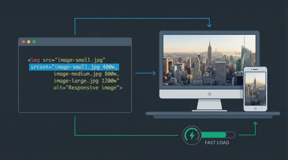
Responsive Images: srcset and sizes
A single image file served to all screen sizes wastes bandwidth on mobile. srcset tells the browser which image files are available; sizes tells it how wide the image will be displayed.
<img
  src="photo-800.jpg"
  srcset="photo-400.jpg 400w, photo-800.jpg 800w, photo-1600.jpg 1600w"
  sizes="(max-width: 600px) 100vw, 50vw"
  alt="Mountain trail in autumn"
  width="800"
  height="533"
>
How to read sizes: "if the viewport is 600px or narrower, the image takes up 100% of the viewport width; otherwise it takes up 50%." The browser uses this to pick the right file from srcset.
For retina/high-DPI displays where you want exact control, use density descriptors instead:
<img
  src="icon.png"
  srcset="icon.png 1x, icon@2x.png 2x"
  alt="Settings icon"
  width="24"
  height="24"
>
The picture Element: Art Direction and Format Switching
srcset is a browser suggestion: it picks the file it thinks is best. The <picture> element gives you control. Use it for two scenarios:
Serving modern formats with fallbacks:
<picture>
  <source type="image/avif" srcset="photo.avif">
  <source type="image/webp" srcset="photo.webp">
  <img src="photo.jpg" alt="Mountain trail in autumn" width="800" height="533">
</picture>
The browser picks the first <source> it supports. AVIF saves roughly 50% file size over JPEG; WebP saves 25-35%. Browsers that support neither fall through to the <img> tag.
Serving different crops for different screen sizes (art direction):
<picture>
  <source media="(max-width: 600px)" srcset="photo-portrait.jpg">
  <source media="(min-width: 601px)" srcset="photo-landscape.jpg">
  <img src="photo-landscape.jpg" alt="Mountain trail in autumn" width="800" height="533">
</picture>
Always include the fallback <img> inside <picture>. The alt, width, and height live on the <img>, not on <source>.
Lazy Loading and Performance Hints
<!-- Above-fold / LCP image: load immediately, high priority -->
<img src="hero.jpg" alt="..." width="1200" height="600" fetchpriority="high">

<!-- Below-fold images: defer loading -->
<img src="article-photo.jpg" alt="..." width="800" height="533" loading="lazy" decoding="async">
loading="lazy" defers the request until the image is near the viewport. Never apply it to your largest above-fold image (your LCP element), since that delays the metric that matters most for page score.
fetchpriority="high" is the opposite hint: it tells the browser to fetch this image before other resources at the same priority level. Use it on your hero image or any image likely to be the LCP element. Browser support is strong in Chrome and Edge; Firefox and Safari added support in late 2024, so it's safe for production use.
decoding="async" lets the browser decode the image off the main thread, keeping the UI responsive during load.
Semantic Markup: figure and figcaption
When an image needs a visible caption, use <figure> and <figcaption> rather than a <div> with a <p> below it:
<figure>
  <img
    src="revenue-chart.png"
    alt="Bar chart: Q3 revenue up 40% year-over-year"
    width="700"
    height="420"
    loading="lazy"
    decoding="async"
  >
  <figcaption>Quarterly revenue by region, Q3 2026. Source: Internal finance report.</figcaption>
</figure>
<figcaption> and alt serve different purposes. The alt describes what's in the image for users who can't see it. The figcaption provides context visible to everyone: source attribution, chart labels, additional explanation. Both can and should coexist.
One <figcaption> per <figure>. It can appear before or after the image. The <figure> element is self-contained: it could be moved elsewhere on the page without losing meaning.
Image as a Link
Wrap <img> in an <a> tag to make it clickable. The alt text becomes the link's accessible name:
<a href="https://example.com/product">
  <img src="product-thumbnail.jpg" alt="View full product details for the Alpine Backpack" width="300" height="300">
</a>
Don't use alt="click here" or alt="link to product". Describe what the image shows and where the link goes, as if the image weren't there.
Common Issues and Fixes
Image shows a broken icon: Check the src path. Relative paths like images/photo.jpg are relative to the HTML file's location, not the stylesheet. Use browser DevTools (Network tab) to see the actual URL the browser is requesting.
Image loads but causes layout shift: You're missing width and height attributes. Add the intrinsic dimensions and confirm your CSS applies height: auto.
Lazy-loaded images never load on slow connections: The browser loads lazy images when they enter the viewport. If users scroll before the page fully loads, some images may appear briefly broken. This is expected behavior: ensure your server responds quickly and consider a low-resolution placeholder.
Once images are loading correctly and efficiently, the same attention to detail applies to the rest of your frontend. CSS animations like underline effects follow similar performance rules, so avoid triggering layout reflows. And if you're implementing dark mode with the CSS light-dark() function, you can use the <picture> element's media attribute to serve different image versions per color scheme without JavaScript.