Staring at a dark theme IDE for eight hours straight with a thin font causes immediate eye strain. You might stick to default settings without realizing how your operating system alters stroke weights, leading to blurry operators and slower bug hunting. Switching to purposefully engineered typography like Fira Code or JetBrains Mono eliminates these rendering issues and dramatically reduces the cognitive friction of scanning dense logic.
| JetBrains Mono | Fira Code | |
|---|---|---|
| Best for | Dark themes, long sessions | Light themes, macOS, functional langs |
| Stroke weight | Heavier | Lighter |
| Ligatures | Conservative set | Extensive (Haskell, F#, Elm) |
| Weights | Variable (4-8) | Variable (4-8) |
| License | Free, open source | Free, open source |
Core Design Differences: x-height and Stroke Weight
The fundamental architecture of a programming font dictates how quickly your eyes can parse distinct variables. JetBrains Mono utilizes a significantly taller x-height than standard monospace alternatives. This design choice makes lowercase letters noticeably larger and more scannable during fast vertical scrolling. Fira Code takes a different route with a slightly more traditional geometric proportion. The letter spacing in Fira Code feels a bit more relaxed, allowing your eyes to glide over the text without feeling cramped.
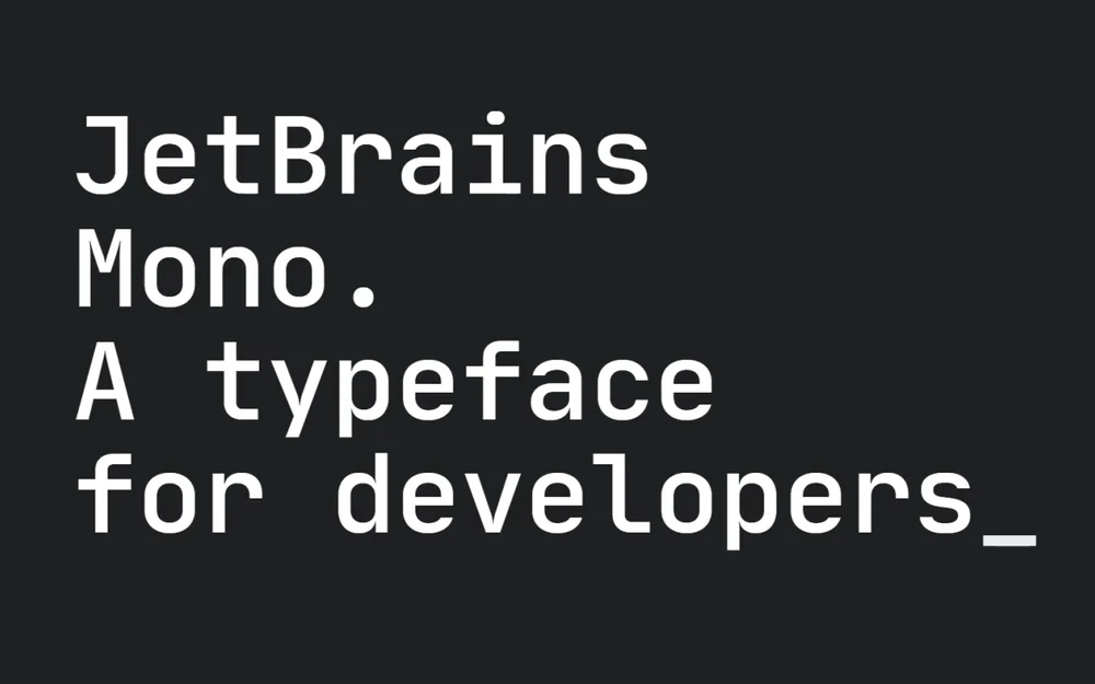
Why JetBrains Mono Dominates Dark Themes
Light pixels bleed into dark backgrounds on modern monitors due to a phenomenon called halation. This optical illusion makes standard fonts look uncomfortably thin, fragile, or overly glaring when placed on a dark gray canvas. JetBrains Mono compensates for this optical bleed with a naturally heavier stroke weight. The characters remain crisp and authoritative against a dark background, making it incredibly easy on the eyes even after hours of coding.
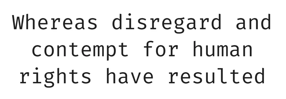
Fira Code's Refined Aesthetics on Light Displays
When you use a heavy, thick font on a light background, the code blocks feel dense and claustrophobic. Fira Code features a refined, lighter baseline stroke weight that perfectly balances the brightness of a light theme. The geometry of the letters feels breathable and elegant. If you code on a high-resolution Retina display with a light theme, Fira Code delivers a surgical, clean aesthetic that heavier fonts simply cannot match.
The Ligatures Controversy: Blessing or Cognitive Load?
Programming ligatures combine two or three symbols into a single cohesive typographic character. Typing an equals sign followed by a greater-than sign transforms instantly into a smooth arrow. Proponents argue this cleans up visual clutter, but the topic sharply divides developer communities, the same debate that comes up around any set of symbols for digital communication that trade explicit characters for compact glyphs.
Functional Programming vs C-Style Syntax
Functional languages like Haskell, F#, or Elm rely heavily on complex, chained operators. Fira Code dominates this space because its ligature library covers nearly every obscure operator combination you will ever encounter. For C-style languages like Java, Go, or TypeScript, the simpler and more conservative ligature set of JetBrains Mono is often more than enough to handle standard equality checks and arrow functions.
Screen Sharing and Paired Programming Risks
Ligatures fundamentally hide the literal characters you are typing on your keyboard. When you pair program or share your screen with a junior developer, they see a beautifully rendered symbol instead of the exact keystrokes required to reproduce it. This visual abstraction causes real cognitive confusion for anyone unfamiliar with your specific setup. You often need to disable ligatures entirely during collaborative debugging sessions to prevent miscommunication over Unicode representations.
Platform and Environment Rendering
Your operating system dictates the final pixel output of your code, not just the font file itself. Windows utilizes DirectWrite, which snaps letters rigidly to the pixel grid for maximum edge sharpness. macOS uses CoreText, prioritizing the original vector shape, which results in a smoother but slightly heavier appearance on the screen.
macOS vs Windows Rendering Differences
Because macOS CoreText naturally emboldens text, Fira Code's lighter stroke weight feels perfectly balanced on Apple hardware. On Windows, Fira Code can sometimes appear too spindly without precise anti-aliasing tweaks. JetBrains Mono, engineered with a robust skeletal frame, looks incredibly sharp and legible out of the box on both Windows and Linux environments.
Terminal Emulators vs GUI Editors
VS Code handles text rendering quite differently than a raw, GPU-accelerated terminal emulator like Alacritty or iTerm2. When you configure your VS Code remote SSH connections to manage a headless server, your local terminal font still dictates your entire visual experience. Clearing out clutter by hiding pycache in VS Code makes your file tree readable, but the correct typography ensures the actual scripts remain legible. A heavy font might look great in the GUI editor but feel overwhelmingly bold in a heavily customized, semi-transparent terminal pane.
Real-World Performance: PR Reviews and Diffing
Reviewing code diffs on GitHub or GitLab requires absolute clarity between added, modified, and removed lines. A misplaced comma or a subtle change in brackets must stand out immediately to prevent merged bugs. The legibility of punctuation is where specialized coding fonts earn their keep. JetBrains Mono uses exaggerated punctuation marks, making semicolons and braces impossible to miss during a fast pull request review.
Variable Font Weights in Action
Both fonts now ship as variable fonts, offering a massive advantage for developers who demand perfection. Variable font formats allow you to dial in the exact weight of your text down to a single decimal point, rather than relying on standard jumps like Light, Regular, or Bold. You can set your diff viewer to a slightly bolder weight than your main editor for better contrast. If your IDE acts up during these complex rendering tasks, you can quickly reset your VS Code extension data cache to force a clean typography reload.
Final Verdict: Which Font Belongs in Your IDE?
Your final choice ultimately depends on your environment setup and theme preference. Use JetBrains Mono for dark themes and long coding sessions where eye fatigue is your primary concern. Choose Fira Code if you work on a Mac with a light theme and write heavily functional code that benefits from extensive ligatures. Configuring your Python virtual environment in VS Code gets your project running, but optimizing your typography keeps you focused.
JetBrains Mono Setup for VS Code
Access your settings by opening the command palette and searching for your JSON configuration file. Paste the following block to enforce the correct weights and enable standard ligatures.
{
  "editor.fontFamily": "'JetBrains Mono', 'Courier New', monospace",
  "editor.fontLigatures": true,
  "editor.fontSize": 14,
  "editor.fontWeight": "400"
}
Fira Code Setup for VS Code
If you choose Fira Code, drop the font weight slightly to take advantage of its refined design. Use this snippet to activate its extensive ligature engine.
{
  "editor.fontFamily": "'Fira Code', Consolas, monospace",
  "editor.fontLigatures": true,
  "editor.fontSize": 14,
  "editor.fontWeight": "300"
}