Staring at jagged characters and poorly spaced operators for eight hours a day silently kills your productivity and strains your eyes. Upgrading your editor font from the system default to a purpose-built coding typeface instantly improves readability and reduces cognitive load during marathon debugging sessions.
| Font | Best For | Ligatures | License |
|---|---|---|---|
| Fira Code | Ligature-heavy workflows, macOS | Extensive | Free |
| JetBrains Mono | Eye strain, dark themes, long sessions | Conservative | Free |
| Cascadia Code | Windows Terminal, Microsoft stack | Moderate | Free |
| MesloLGS NF | Terminal Powerline glyphs | N/A | Free |
| MonoLisa | Premium ergonomics, 140+ ligatures | Extensive | Paid |
Why Active Developers Abandon Consolas
Consolas served developers well for years, but modern coding environments demand more advanced typographic features. Relying on older system fonts often leads to misreading identical-looking characters like the number 1, lowercase l, and uppercase I.
Modern coding fonts solve this with distinct glyph designs and wider character spacing. They also introduce ligatures, a feature entirely missing from older typefaces like Consolas. Making the switch instantly upgrades your workspace aesthetics and reduces typos caused by visual confusion.
Top Free Fonts for VS Code: The Big Three
Choosing the right free font comes down to your preference for character height and ligature style. These three options dominate the developer community for good reason.
Fira Code
Fira Code holds over 78,000 GitHub stars and remains the undisputed king of programming ligatures. It transforms standard operator sequences into clean, single-character mathematical symbols.
Installation:
- Download the latest release from the Fira Code GitHub repository.
- Extract the ZIP file and navigate to the ttf folder.
- Select all font files, right-click, and install them on your operating system.
- Restart VS Code to ensure the system recognizes the new files.
{
  "editor.fontFamily": "'Fira Code', Consolas, monospace",
  "editor.fontLigatures": true
}
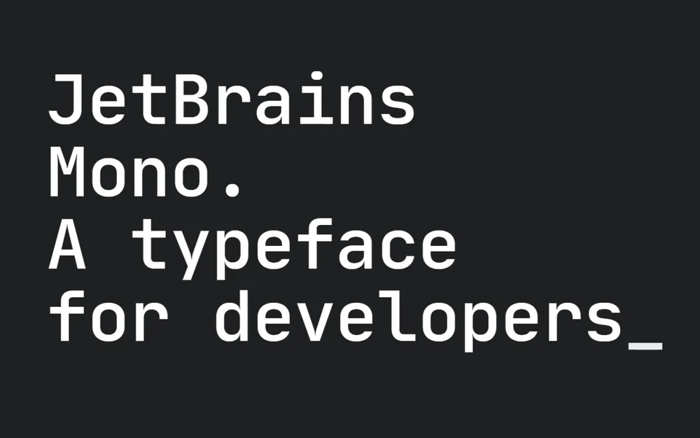
JetBrains Mono
JetBrains Mono maximizes readability by significantly increasing the height of lowercase letters. This design choice keeps your eyes relaxed even after hours of continuous coding.
Installation:
- Download the font pack from the official JetBrains website.
- Open the ttf directory inside the downloaded archive.
- Install all font variants to your system.
- Reload your editor.
{
  "editor.fontFamily": "'JetBrains Mono', Consolas, monospace",
  "editor.fontLigatures": true
}
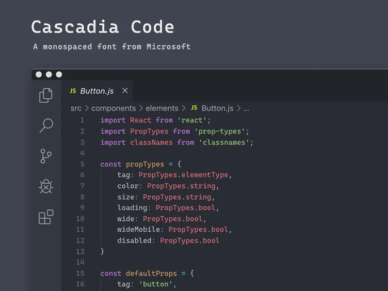
Cascadia Code
Backed directly by Microsoft, Cascadia Code integrates flawlessly with the Windows ecosystem and the new Windows Terminal. It offers a slightly heavier weight that looks exceptionally crisp on high-resolution displays.
Installation:
- Grab the latest release from the Cascadia Code GitHub page.
- Locate the ttf folder within the extracted contents.
- Install the static font files to your OS.
- Restart your development environment.
{
  "editor.fontFamily": "'Cascadia Code', Consolas, monospace",
  "editor.fontLigatures": true
}
Premium Coding Fonts: Is MonoLisa Worth the Price?
While open-source fonts provide immense value, premium options like MonoLisa offer unique ergonomic benefits. This font focuses on warmth and humanistic curves rather than rigid geometric shapes.
MonoLisa includes over 140 custom ligatures and slightly wider letters to prevent eye fatigue. Paying for a font might seem unnecessary to some, but developers who stare at screens for a living often treat it as a crucial investment in their daily comfort.
The Ligatures Debate: Productivity Boost or Distraction?
Ligatures combine multiple characters like != or => into a single, cohesive symbol. Many developers find this incredibly clean and mathematical.
However, some programmers argue that ligatures hide the actual characters you type, creating confusion for beginners reading your screen. Turning them on or off is purely a matter of personal preference, but trying them for at least a week is the best way to decide.
Full Font Configuration in settings.json
Applying your new font requires a quick edit to your workspace configuration file. Open your command palette with Ctrl+Shift+P (or Cmd+Shift+P on Mac) and type Open Settings (JSON).
Add these lines to the root of your configuration object:
{
  "editor.fontFamily": "'JetBrains Mono', Consolas, monospace",
  "editor.fontLigatures": true,
  "editor.fontSize": 14,
  "editor.fontWeight": "400"
}
While you are in settings.json, this is also a good time to hide the pycache folder in VS Code to keep your file explorer panel clean.
VS Code Terminal vs. Editor Fonts
Your integrated terminal requires a completely different setup from your main editor. Command-line tools like Zsh, Oh My Posh, and Git indicators rely on special icons called Powerline glyphs.
Standard coding fonts do not include these icons, resulting in broken square symbols in your terminal. You must install a Nerd Font variant, like MesloLGS NF, specifically for the terminal panel. When setting up complex server connections via VS Code remote SSH, a properly configured Nerd Font ensures your remote terminal prompts render correctly.
{
  "terminal.integrated.fontFamily": "'MesloLGS NF'"
}
Ideal Font Sizing by Monitor Resolution
Picking the right font size depends entirely on your monitor size and display scaling. Using text that is too small forces you to lean forward, causing posture problems over time.
- 1080p monitors: 13pt to 14pt for the best balance of screen real estate and legibility
- 1440p (2K) monitors: 15pt to 16pt to compensate for the higher pixel density
- 4K monitors: 18pt or higher unless you use heavy OS-level display scaling
If you spend hours reading terminal output while setting up a Python virtual environment in VS Code, proper font sizing prevents severe eye fatigue and keeps you focused.
Best Font and Theme Pairings
Certain typefaces naturally complement specific color schemes based on their contrast and character weight. Matching your font to your theme creates a cohesive workspace.
- One Dark Pro + Fira Code: The vibrant neon colors of One Dark Pro pop against the clean, mathematical ligatures of Fira Code.
- Dracula + JetBrains Mono: Dracula's strong purple and pink accents pair well with the tall, readable structure of JetBrains Mono.
- Solarized + Cascadia Code: The low-contrast, warm Solarized background needs a thicker font like Cascadia Code to maintain readability.
Troubleshooting: Fonts or Ligatures Not Working
The most common issue occurs when VS Code cannot find the font name you typed. Always wrap font names containing spaces in single quotes within your JSON file.
If your font is installed but ligatures still refuse to render, the editor might be holding onto old cached data. Sometimes UI glitches require you to reset VS Code extension data to force a complete interface refresh. Always restart your entire PC if a newly installed font fails to appear in the editor after a basic application restart.