Nothing ruins a site's performance faster than a poorly coded JavaScript custom cursor that triggers layout thrashing on every single mouse movement. Building a custom cursor requires strict coordinate calibration, GPU-accelerated transforms, and accessibility fallbacks to avoid blocking standard user interactions.
| Feature | CSS cursor Property |
JavaScript DOM Element |
|---|---|---|
| Max Dimensions | 128x128px (Chromium/Firefox) | Unlimited (keep reasonable) |
| Optimal Size | 32x32px | Varies by design |
| Best Formats | PNG, SVG (static), CUR | HTML/CSS, SVG |
| Performance Impact | Zero (native rendering) | High (requires GPU optimization) |
| Click-Through | Native | Requires pointer-events: none |
The CSS-First Approach: Using the cursor Property
Relying on native CSS is always the most performant way to change the mouse pointer. Browsers handle CSS cursors at the system level, guaranteeing zero latency between physical mouse movement and screen rendering.
.custom-area {
  cursor: url('cursor.png'), auto;
}
Always declare a native fallback keyword like auto or pointer at the end of your CSS rule. If the image fails to load or the browser rejects the format, the user still gets a functional pointer.
Zero HTTP Requests: Creating Cursors with SVG Data URIs
Fetching an external image file for a cursor adds an unnecessary HTTP request to your load time. You eliminate this network latency completely by using an SVG data URI directly inside your stylesheet.
.custom-area {
  cursor: url("data:image/svg+xml,%3Csvg xmlns='http://www.w3.org/2000/svg' width='32' height='32' viewBox='0 0 32 32'%3E%3Ccircle cx='16' cy='16' r='8' fill='%23000'/%3E%3C/svg%3E"), auto;
}
Converting your SVG into a percent-encoded or Base64 string allows you to embed the exact shapes and colors without relying on external assets. It keeps your CSS self-contained and guarantees the cursor loads instantly alongside your styles.
Hotspot Calibration and Fallback Strategies
By default, the browser registers a click at the top-left corner (coordinates 0 0) of your custom image. If your cursor design is a crosshair or a centered circle, this default positioning makes clicking buttons feel completely inaccurate.
You fix this by defining the exact X and Y coordinates of your hotspot right after the image URL. For a 32x32px image where the center is the active pointing tip, use url('cursor.png') 16 16, auto. This shifts the click registration exactly to the middle of the graphic.
/* Hotspot centered at 16,16 for a 32x32 cursor */
.crosshair-cursor {
  cursor: url('crosshair.png') 16 16, crosshair;
}

/* Hotspot at tip of a pointer arrow */
.arrow-cursor {
  cursor: url('arrow.png') 4 2, pointer;
}
The second value pair is the only mechanism for controlling click accuracy on custom cursors. Missing it is the most common bug in CSS cursor implementations.
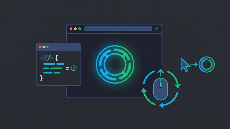
Building Advanced Custom Cursors with JavaScript
Native CSS cursors are static. When your design requires trailing animations, dynamic sizing, or hover states that morph the cursor shape, you must use a custom HTML element controlled by JavaScript.
<div class="cursor" id="cursor"></div>
.cursor {
  width: 20px;
  height: 20px;
  border: 2px solid #000;
  border-radius: 50%;
  position: fixed;
  pointer-events: none;
  top: 0;
  left: 0;
  z-index: 9999;
}

body {
  cursor: none;
}
const cursor = document.getElementById('cursor');

document.addEventListener('mousemove', (e) => {
  cursor.style.transform = `translate3d(${e.clientX - 10}px, ${e.clientY - 10}px, 0)`;
});
This involves setting body { cursor: none } and tracking the mousemove event to update the position of a custom div.
The Essential pointer-events: none Fix
A custom JavaScript cursor is essentially an HTML element sitting absolutely positioned on top of your entire document. Because it constantly follows the mouse, it physically blocks every click meant for the links and buttons underneath it.
Applying pointer-events: none to your custom cursor element solves this instantly. It forces the browser to ignore the cursor div during click events, allowing user interactions to pass straight through to the DOM elements below.
.cursor {
  pointer-events: none; /* Required: without this, the cursor div blocks all clicks */
}
This is the single most common bug when implementing a JavaScript cursor for the first time. The element renders correctly, but buttons and links stop responding.
GPU Acceleration with translate3d (Avoiding Layout Thrashing)
Updating top and left CSS properties inside a mousemove event listener destroys rendering performance. It forces the browser to recalculate the page layout on every single frame, causing the cursor to stutter and lag.
Move the element using transform: translate3d(x, y, 0) instead. This specific property forces the browser to offload the rendering task to the GPU. The result is buttery smooth 60fps animation that does not trigger expensive layout repaints.
// Bad: triggers layout recalculation on every frame
cursor.style.left = e.clientX + 'px';
cursor.style.top = e.clientY + 'px';

// Good: GPU-composited, no layout thrash
cursor.style.transform = `translate3d(${e.clientX - 10}px, ${e.clientY - 10}px, 0)`;
The same GPU-offloading principle applies to other CSS motion effects. CSS animations built on transform and opacity always outperform those that animate positional or dimensional properties.
Creating a Trailing Cursor Effect with requestAnimationFrame
Attaching your position updates directly to the mousemove event creates a stiff, mechanical feel. To create a smooth, trailing lag effect, decouple the mouse coordinates from the visual rendering.
Store the target mouse coordinates in variables during the mousemove event. Then, use requestAnimationFrame to run a continuous loop that slowly interpolates the cursor's current position toward the target coordinates using easing math. This creates a fluid, elastic follow effect.
let targetX = 0, targetY = 0;
let currentX = 0, currentY = 0;
const ease = 0.15; // Lower = more lag, higher = snappier

document.addEventListener('mousemove', (e) => {
  targetX = e.clientX - 10;
  targetY = e.clientY - 10;
});

function animate() {
  currentX += (targetX - currentX) * ease;
  currentY += (targetY - currentY) * ease;
  cursor.style.transform = `translate3d(${currentX}px, ${currentY}px, 0)`;
  requestAnimationFrame(animate);
}

animate();
Adjust the ease value between 0.05 (heavy drag) and 0.3 (near-instant) to control the trailing intensity.
Dynamic Color Inversion Using mix-blend-mode
A black custom cursor completely disappears when the user moves it over a dark image or a black section of your layout. Writing complex JavaScript to detect the background color beneath the cursor is highly inefficient.
Apply mix-blend-mode: difference to your custom cursor element via CSS. Pair this with a white background on the cursor itself. The browser will automatically invert the cursor's color relative to whatever element sits directly behind it, ensuring perfect contrast at all times.
.cursor {
  background: #fff;
  mix-blend-mode: difference;
  pointer-events: none;
  position: fixed;
}
On a white background the cursor appears black. On a black background it turns white. On a colored background it inverts to the complementary color. This technique pairs well with dynamic themes like CSS `light-dark()` function implementations where section backgrounds shift between light and dark.
Format Support and Browser Size Limits
Browser support for custom cursor images is highly specific and often undocumented. Feeding the browser the wrong file type or size causes the cursor rule to fail silently with no console error.
PNG vs. SVG vs. CUR: Which Format Works Best?
PNG offers the most reliable cross-browser support for custom cursors. It handles transparency perfectly and renders predictably across every operating system.
Chromium and Firefox enforce a hard limit of 128x128 pixels for cursor images. Attempt to load a 256x256 image, and the browser simply drops it without throwing an error. Sticking to 32x32 pixels provides the sharpest results and avoids triggering cross-platform scaling bugs.
SVGs are restricted to secure static mode for cursor use, meaning any animations, scripts, or external font references inside the SVG file will be stripped out by the browser. If you need an animated cursor effect, the JavaScript approach is the only reliable path.
The CUR format works reliably on desktop browsers but has no mobile support. ANI (animated cursor) format has inconsistent cross-browser support and should be avoided in production.
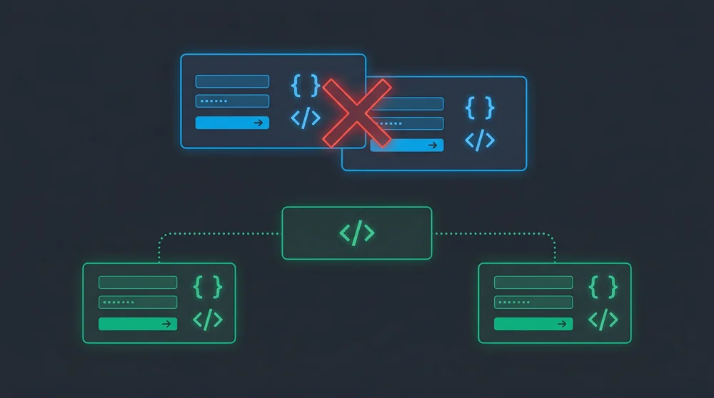
UX Anti-Patterns: When NOT to Use Custom Cursors
Custom cursors often prioritize aesthetics over basic usability. Hiding the default cursor without a bulletproof fallback strategy creates a nightmare scenario for users relying on assistive technologies or different input devices.
Never override the standard pointer cursor on interactive elements like buttons, links, or form inputs. Users rely on that subtle system-level visual cue to know an element is clickable. If your custom cursor design removes that feedback, users will assume your interface is broken.
/* Restore the default pointer on interactive elements */
a, button, [role="button"], input, select, textarea {
  cursor: pointer !important;
}
Keep custom cursor styling strictly for the default auto state and restore the native pointing hand for interactions. Cursor customization is a visual detail; it should never interfere with the functional signals the OS cursor system provides.
Start with the CSS cursor property. If the design calls for static images or SVG shapes, that covers 80% of use cases. Only reach for the JavaScript approach when you need trailing effects or dynamic morphing. When you do, always wire up pointer-events: none first, then switch to translate3d, and test the fallback in incognito mode with a clean profile before shipping.