grid-template-areas replaces hard-to-read row and column coordinates with named regions such as "header header" "sidebar main". Assign matching grid-area names to the child elements, keep the strings rectangular, and change the map inside a media query when the mobile layout needs a different visual order.
grid-template-areas: Named CSS Grid Layouts
How to use grid-template-areas to build a readable, named CSS Grid layout, plus a full responsive dashboard example and common mistakes to avoid.
// The short answer

Ekin Yalgın
6 min read
In this guide · 5 sections
If you’ve ever juggled grid column and row numbers across three different breakpoints, you know how brittle that code can get. One tiny design tweak and suddenly you're recalculating numbers across four media queries just to keep things aligned. That’s why grid-template-areas is such a lifesaver: it swaps those confusing track numbers for an actual visual blueprint right inside your CSS. Updating layouts on different screens goes from a headache to a quick, intuitive edit.
- Browser Support: Solid everywhere that matters (Chrome 57+, Safari 10+, Edge 16+, Firefox 52+)
- Default Value:
none - Applies To: Grid containers (
display: grid) - Prerequisite: Child elements need assigned
grid-areanames
The Visual Power of Named Grid Areas
Most tutorials start you off thinking about CSS Grid in terms of start and end lines. That’s fine for basic setups, but as soon as a design gets even slightly complex, tracking stuff like grid-column: 1 / 3 alongside grid-row: 2 / 5 forces you to do mental gymnastics every time you read the file.
Named grid areas let you step back and think like a designer. You give each chunk of your page a clear nickname, then literally sketch out where those chunks live using plain text strings. Anyone pulling down your repo can glance at the parent rule and immediately see how the entire page fits together - no devtools or HTML cross-referencing required.
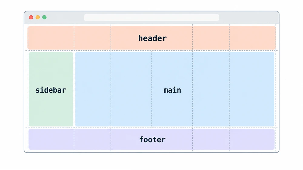
Basic Syntax: Defining Your Grid
Getting this running takes just two pieces: a parent container that defines the layout map, and child elements tagged with matching names. Think of each quoted string as a single row, and every word inside that string as a column cell within that row.
Assigning grid-area to Child Elements
First up, tag your individual child elements using the grid-area property. Keep these identifiers simple and unquoted - they work just like custom property names or class keywords.
CSS
.site-header { grid-area: header; }
.site-nav { grid-area: sidebar; }
.site-main { grid-area: content; }
.site-footer { grid-area: footer; }
Once your children have identities, you can assemble the map on the parent wrapper. Whenever you repeat a name across adjacent cells, the browser automatically merges them into a single continuous block.
CSS
.container {
  display: grid;
  grid-template-columns: 250px 1fr;
  grid-template-rows: 60px 1fr 40px;
  grid-template-areas:
    "header header"
    "sidebar content"
    "footer footer";
}
Creating Empty Cells with Dots
What if you don't want every cell packed with content? Just drop in a single period (.) or even multiple dots without spaces (like ...) to mark that spot as intentional blank space.
This comes in super handy for asymmetrical art-direction or cards where an action button floats out in the open. Just make sure you leave normal spaces between your dots and any neighboring area names.
CSS
.hero-section {
  display: grid;
  grid-template-areas:
    "image text text"
    "image . ."
    "image button .";
}
Real-World Example: Responsive Dashboard Layout
Where this approach truly pays off is responsive design. Picture your typical SaaS dashboard: there’s a persistent top bar, a vertical navigation drawer, a central feed, and a footer at the base.
Desktop View Configuration
On desktop monitors, you probably want that sidebar pinned along the left rail spanning past the main workspace and footer, while the header runs full-width along the top.
CSS
.dashboard {
  display: grid;
  min-height: 100vh;
  grid-template-columns: 250px 1fr;
  grid-template-rows: auto 1fr auto;
  grid-template-areas:
    "header header"
    "sidebar main"
    "sidebar footer";
}
Mobile Stacking with Media Queries
If this were built with line numbers, shifting to a mobile view would mean writing overrides for practically every child class to reset their start and end points. With named areas, your children don’t need a single touch. You simply redraw the map on the parent.
CSS
@media (max-width: 768px) {
  .dashboard {
    grid-template-columns: 1fr;
    grid-template-rows: auto auto 1fr auto;
    grid-template-areas:
      "header"
      "sidebar"
      "main"
      "footer";
  }
}
Just like that, your whole page snaps into a clean vertical stack just by tweaking four strings on the parent container.
Common Mistakes and Invalid Grids
While the syntax feels wonderfully simple, the CSS parser is pretty strict about the geometry. Here are the three gotchas that usually break a grid map:
- Non-rectangular areas: Every named region must resolve to a clean rectangle. You cannot make an "L" or "T" shape. Trying to curl a sidebar under the main section with the same keyword invalidates the whole template.
- Mismatched column counts: Every row string has to declare the exact same number of cells, whether they're words or placeholder dots. If row one sets up three columns, every other row must have three tokens too.
- Missing or messy quotes: Each individual row needs its own closing and opening quotation marks. Forgetting a quote between lines is the fastest way to break the rule.
grid-template-areas vs. Line Numbers
Neither method is universally "better" - it comes down to the problem you're tackling. Think of it like deciding between Grid vs. Flexbox: pick the tool that matches the structural complexity of what you're building.
| Feature | grid-template-areas | Numerical Placement (grid-column / grid-row) |
|---|---|---|
| Readability | Outstanding. The CSS looks like a wireframe of your page. | Lower. You have to trace coordinate lines in your head. |
| Maintenance | Effortless. Restructure breakpoints inside a single parent rule. | Cumbersome. You usually have to edit multiple child elements. |
| Overlapping Elements | Impossible by design. Areas cannot occupy the same cell. | Fully supported. Multiple items can share coordinates with z-index. |
| Complex/Dynamic Grids | Best for macro page shells and predictable UI panels. | Ideal for dense data grids, programmatic loops, and auto-placement. |
Quick answers
Frequently asked questions
Can you use grid-template-areas without grid-area?
No. Without assigned grid-area names on the child elements, the container won't place them according to your template map. The browser will position them using the standard auto-placement algorithm instead. The two properties need to work together.
Can grid-template-areas make an L-shaped area?
No. Each named area must form one continuous rectangle or square across the grid. Using the same name to make an "L," "T," or horseshoe shape makes the declaration invalid, so the browser ignores the entire template.
How do you leave an empty cell in grid-template-areas?
Put a period (.) or several consecutive periods (...) where you want an empty cell. The browser treats them as an unnamed cell, so no item is placed there unless you position it explicitly. Leave a space between the dots and neighboring area names.
Does grid-template-areas affect HTML source order and accessibility?
Yes. Rearranging items with grid areas can make their visual order differ from their DOM order. Keyboard navigation and screen readers still follow the HTML structure, so keep the important reading and tab order logical in the HTML.
Why is my grid-template-areas property not working?
Uneven rows are a common cause: every row needs the same number of cells. Non-rectangular areas and missing quotation marks around row strings also invalidate the property. Check the declaration in browser dev tools for errors.
Can you overlap items when using grid-template-areas?
No. Each cell in the template map can have only one area name, so named areas can't overlap. For layered elements, use explicit grid-column and grid-row line numbers instead.
How do media queries work with grid-template-areas?
Redefine the grid-template-areas map on the parent container inside a media query. The child elements keep their grid-area names, so you don't need to update each component's styles. Your breakpoint changes stay in one place.
Do area names inside grid-template-areas require quotation marks?
Each row string needs quotation marks, but the area names within it don't need their own quotes. On a child element, assign the name directly to grid-area as an unquoted identifier, such as grid-area: sidebar. Quoting an individual name prevents it from matching the template.
Something wrong or out of date?
Tools change fast. Tell the editor what no longer works.