

Trying to fit semantic HTML into a rigid design can make nested grids hard to manage. Card footers stop lining up, columns leave awkward gaps, and you may end up adding unnecessary <div> tags just to make the layout work. CSS Subgrid lets nested elements share their parent’s grid tracks, so you can keep the markup clean without giving up alignment.
- Browser Support (2026): About 96% globally (Chrome 117+, Safari 16+, Firefox 71+, Edge 117+)
- Core Syntax:
grid-template-columns: subgrid;orgrid-template-rows: subgrid; - Primary Use Case: Aligning elements inside sibling containers, such as card footers or form labels.
- SEO & Accessibility Benefit: Reduces unnecessary wrappers. You can keep proper
<ul>,<li>, and<article>semantics while maintaining the layout.
The Problem with Nested Layouts (and Flat Grids)
In a standard CSS Grid, only the direct children of a .grid-container take part in that grid’s layout.
Imagine a three-column portfolio section where each project’s image, title, and description need to line up across the row. Placing every element directly in the main grid makes alignment easy.
But those elements belong together inside an <article> or <li> tag. Once you add that wrapper, it becomes the grid item. The image, title, and text inside it no longer share the parent’s grid tracks.
If one card has a long title and another has a short one, their buttons can end up at different heights.
What Is CSS Subgrid?
CSS Subgrid lets a child grid use its parent’s tracks instead of defining a separate set.
That means you don’t have to guess column widths or set fixed heights for nested elements. The child remains a grid container for its contents, but its tracks come from the parent. Elements inside neighboring cards can then line up, even when they’re nested several levels down.
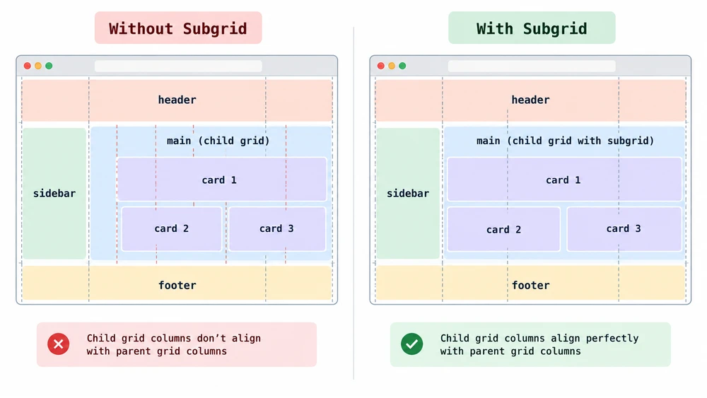
How to Use CSS Subgrid
First, set the child element to display: grid. Then apply the subgrid keyword to its rows, columns, or both.
Inheriting Columns with grid-template-columns: subgrid
Inherit columns when nested items need to line up horizontally with the main page layout. This works well for editorial pages where text blocks and pull quotes follow the same 12-column grid.
.main-layout {
  display: grid;
  grid-template-columns: repeat(12, 1fr);
  gap: 20px;
}

.article-section {
  /* Spans 8 columns of the parent grid */
  grid-column: 3 / 11;
  display: grid;
  /* Borrows those 8 columns for its own children */
  grid-template-columns: subgrid;
}

.article-image {
  /* Perfectly aligns to the main layout's columns */
  grid-column: 1 / -1;
}
Inheriting Rows with grid-template-rows: subgrid
Inheriting rows helps keep cards with different amounts of content aligned. A card’s header, body, and footer can follow the row tracks of the main container.
.card-grid {
  display: grid;
  grid-template-columns: repeat(auto-fill, minmax(300px, 1fr));
  /* Creates 3 distinct row tracks for each card's content */
  grid-template-rows: max-content 1fr max-content;
  gap: 30px;
}

.card {
  display: grid;
  /* Forces the card to span 3 rows of the parent */
  grid-row: span 3;
  /* Adopts those 3 exact rows */
  grid-template-rows: subgrid;
  gap: 0; /* Gap is inherited from the parent */
}
Real-World CSS Subgrid Examples
Subgrid is especially useful when repeated components need to line up despite differences in their content.
Perfectly Aligning Card Footers
Product grids can be tricky to keep tidy. One product has a one-line title; another has a three-line title. Without subgrid, the second product’s “Add to Cart” button may sit lower than the first.
Apply grid-template-rows: subgrid to the product cards, and the parent grid can size the shared title row to fit the tallest title. The buttons then sit on the same final row track, regardless of how much text each card contains.
Complex Form Layouts
Forms with nested fieldsets can also be difficult to align. You may want labels in one fieldset to line up with labels in another, but each wrapper normally controls its own layout.
Make the <form> the main grid and set each <fieldset> to grid-template-columns: subgrid. Their labels and inputs can then share column tracks. A longer label in one section can widen the label column throughout the form, keeping the inputs aligned.
CSS Subgrid Browser Support in 2026
Subgrid is supported by modern versions of Safari, Chrome, Firefox, and Edge. For most web projects, it’s ready to use in production.
Fallback Strategies for Older Browsers
If your analytics show that you need to support older browsers, use a CSS Feature Query (@supports) to provide a fallback.
Start with a flexbox or nested grid layout that works without subgrid. Then use the @supports rule to apply the subgrid layout where it’s supported.
/* Fallback for older browsers */
.card {
  display: flex;
  flex-direction: column;
}
.card-body {
  flex-grow: 1; /* Pushes footer to the bottom */
}

/* Progressive enhancement */
@supports (grid-template-rows: subgrid) {
  .card-grid {
    grid-template-rows: max-content 1fr max-content;
  }
  .card {
    display: grid;
    grid-row: span 3;
    grid-template-rows: subgrid;
  }
}
CSS Subgrid vs. Nested Grid: Key Differences
Choose between a standard nested grid and subgrid based on whether elements in separate child containers need to align. Both can work alongside the auto-fit and minmax techniques used in responsive grids.
| Feature | Standard Nested Grid | CSS Subgrid |
|---|---|---|
| Track Sizing | The child defines its own columns and rows. | The child uses its parent’s track sizes. |
| Sibling Alignment | Elements in different child containers don’t share tracks. | Elements in different child containers can align on shared tracks. |
| Gap Inheritance | The child defines its own gap. | The child inherits the parent’s gap unless you override it. |
| Best For | Self-contained components, such as an isolated widget. | Repeated components, such as article feeds or pricing tables. |