

We’ve all been there: you throw flex-wrap on a container, slap fixed percentage widths onto child divs, and everything looks fine until you test on mobile and the whole layout falls apart. Instead of randomly toggling between display properties until things snap into place, it helps to pause and look at what your content is actually trying to do.
| Feature | CSS Flexbox | CSS Grid |
|---|---|---|
| Core approach | Content-first: the layout naturally wraps around item sizes | Layout-first: items drop into predefined tracks |
| Sweet spot | Small UI components, linear flows, clean alignment | Page shells, dashboard grids, cross-row alignment |
| Wrapping behavior | Items wrap line by line, sizing themselves independently | Items snap into rigid columns and rows across the entire grid |
| Responsiveness | Fluid sizing via flex-grow and flex-shrink |
Smart automatic tracks with minmax() and auto-fit |
The Key Difference: Content First vs. Layout First
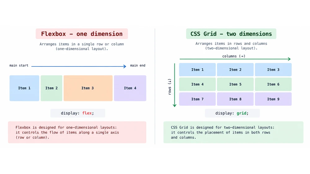
You’ve almost certainly heard the rule of thumb that Flexbox is one-dimensional and Grid is two-dimensional. It’s a handy mental shortcut, but it doesn't give you much practical guidance when you're staring at an empty CSS file. A much better question to ask yourself is simple: should the content drive the container, or should the container dictate where the content goes?
Flexbox works from the inside out. The container looks at the natural footprint of each child element first, calculates how much breathing room they need, and then shares out whatever space is left over.
CSS Grid takes the exact opposite approach. The parent container lays down rigid tracks right out of the gate, and child elements are slotted into those boundaries whether they fill them completely or not.
If you have elements whose footprints ought to adjust naturally to the length of their copy, Flexbox is usually your best bet. But if you have a short snippet of text that needs to visually line up with an image two cards down, you want Grid to establish that shared skeleton.
When to Choose Flexbox (With Concrete UI Patterns)
Flexbox shines brightest inside isolated UI components where alignment and natural flow matter far more than rigid coordinates. Reach for it whenever the direct spatial relationship between sibling elements is what actually defines the layout.
- Navigation bars and header menus: dropping in
justify-content: space-betweeneffortlessly anchors your brand logo to the left edge while tucking nav links neatly against the right. - Icon and label pairings: just a couple of Flex rules let you center an SVG icon beside some accompanying copy without fighting fussy vertical margins.
- Variable-length tags and chips: category pills can just expand to fit their text labels and cleanly spill onto the next line whenever they run out of horizontal space.
Here’s a quick look at a simple, content-driven component where Flexbox feels right at home:
CSS
.tag-container {
  display: flex;
  flex-wrap: wrap;
  gap: 12px;
}

.tag {
  /* The content decides the size, flex handles the spacing */
  padding: 6px 12px;
}
When to Choose CSS Grid (With Concrete UI Patterns)
Grid is built for the macro level - page shells and structural sections where items across different rows and columns need to stay tethered to one another. It completely frees you from having to do mental math on percentage widths across different breakpoints.
- Full-page scaffolds: tools like
grid-template-areasgive you a clean, readable blueprint for headers, sidebars, main feeds, and footers. - Product catalog card decks: cards can line up neatly in tidy rows, keeping call-to-action buttons anchored on the exact same baseline even when product descriptions vary wildly in length.
- Multi-panel dashboards: widgets can stretch across multiple columns or span multiple rows while staying locked into the overarching system layout.
Even better, Grid lets you build responsive layouts that adjust cleanly across breakpoints without needing a mountain of media queries.
CSS
.card-gallery {
  display: grid;
  /* Automatically creates as many columns as will fit, with a 300px minimum */
  grid-template-columns: repeat(auto-fit, minmax(300px, 1fr));
  gap: 24px;
}
By leaning on auto-fit alongside minmax(), you let the browser handle column recalculations organically as viewport widths shrink or expand.
Common Layout Traps
It’s tempting to default to Flexbox for everything, particularly if that’s the tool you learned first. But that habit often leads developers into a corner, trying to force rows of independently wrapped flex items to mimic a strict, rigid grid layout.
If you catch yourself layering on media queries, rigid width hacks, and negative margins just to force elements to align across rows, take a step back - Grid will solve that with a fraction of the code.
The exact same logic applies in reverse for lightweight elements. You don’t need an entire Grid configuration with named templates just to set an avatar image next to a user’s display name. Flexbox handles that cleanly in two lines.
Combining Both in Practice
In real-world web development, you rarely choose one over the other across an entire site; they do their best work together. Let CSS Grid handle your macro scaffolding and any sections needing strict cross-row coordination, and let Flexbox manage the smaller internal bits within those compartments.
Think of an e-commerce feed: CSS Grid establishes the structured columns holding your product cards, while Flexbox operates inside each card to neatly separate the title, price tag, and checkout button. Hand each layout challenge to the tool specifically built to handle it.