auto-fit collapses empty grid tracks and stretches the items that remain, while auto-fill keeps the empty tracks and can leave blank slots at the end of a wide row. They behave the same while every possible track has content, so choose auto-fit for fluid cards and auto-fill when preserving a stable gallery grid matters more than filling extra space.
auto-fit vs auto-fill in CSS Grid
The real difference between auto-fit and auto-fill in CSS Grid, with concrete UI use cases for each and how minmax() controls the responsive behavior.
// The short answer

Ekin Yalgın
5 min read
In this guide · 4 sections
If you've ever built a responsive CSS Grid and ended up with weird, lingering gaps on the right edge - or cards that stubbornly refuse to stretch out on a desktop monitor - you know how annoying that is. Nine times out of ten, the culprit hides in a single word inside your repeat() rule: choosing between auto-fit and auto-fill. Pick the wrong one, and you'll find yourself slapping band-aid media queries on the container just to nudge everything back into place.
| Keyword | Core Behavior | How It Handles Extra Room | Where It Shines |
|---|---|---|---|
| auto-fit | Drops unused columns down to zero | Expands current cards so they fill the row | E-commerce feeds, fluid blog archives |
| auto-fill | Keeps ghost columns sitting there | Reserves empty spaces without expanding items | Photo albums, avatar lists, structured slots |
What Is the Difference Between auto-fit and auto-fill?
On mobile screens and narrow viewports, you won't spot any difference between them. Both happily wrap your cards into clean, stacked rows as screen real estate shrinks. The fork in the road happens once the window gets wide enough to host another column, but you've run out of content to put in that new spot.
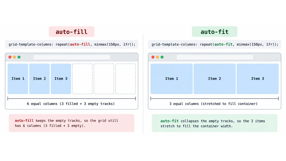
How auto-fill Works (Implicit Columns)
Think of auto-fill as a literal planner. It looks at the container width and says, "Can I carve out another slot using that minimum width?" As soon as the browser finds enough room, it builds an invisible, empty column track right there on the end.
- That phantom column takes up genuine space on the grid line.
- The cards you actually have stay locked at their current dimensions.
- The overall layout keeps its strict scaffolding, leaving an obvious gap sitting at the end of the row.
How auto-fit Works (Collapsing Empty Tracks)
Instead of letting those empty columns sit around taking up space, auto-fit squashes them down to zero width. With those ghost tracks out of the equation, the browser takes whatever spare horizontal room is left and divides it among the cards that actually exist.
- Empty columns completely vanish from the layout flow.
- Your existing elements stretch wider to swallow the room those tracks would have taken.
- Your rows always look deliberate and complete, no matter how few items are loaded.
Real-World Use Cases
Deciding which keyword belongs in your styles really boils down to how you want the grid to react when content counts go up or down.
When to Use auto-fit (Product Cards & Fluid Grids)
Reach for auto-fit when you're styling product catalogs or blog feeds. Imagine a shopper filters down a category and only two products match instead of the usual four. With auto-fit, those two items gracefully expand across the row rather than huddling in the left corner, keeping the layout looking polished without writing extra conditional classes.
When to Use auto-fill (Image Galleries & Fixed Slots)
Grab auto-fill whenever your items need to stay consistent in size and alignment, like a user avatar list or a uniform gallery wall. If someone only has three saved photos in a layout designed for five across, stretching those three photos to billboard size looks awkward. Leaving empty slots maintains the visual rhythm of your interface.
How minmax() Works with Auto-Placement
The magic really comes together when you pair either keyword with minmax(). This one combo is usually all you need for collapsing a 4-column layout down to one on mobile. Hardcoding fixed pixel widths won't cut it because the browser needs flexible room to calculate track wrapping.
CSS
/* The standard responsive grid formula */
.grid-container {
  display: grid;
  grid-template-columns: repeat(auto-fit, minmax(250px, 1fr));
  gap: 1.5rem;
}
Setting that 250px floor guarantees your content never gets squished into an unreadable column. Meanwhile, the 1fr ceiling tells the browser to share whatever leftover pixels remain. In an 800px box, for instance, three 250px columns take up 750px, and that trailing 50px gets sliced up and added across all three cards evenly.
Common Mistakes When Using repeat()
A few sneaky syntax slips can completely break your column definition without throwing an obvious error.
- Mixing hard numbers with auto: writing
repeat(3, auto-fit)isn't valid CSS, so the browser simply drops the entire rule and your layout collapses. - Skipping the fractional ceiling: dropping in
minmax(200px, 400px)instead of using1frcaps your elements at an arbitrary maximum width. On ultrawide displays, this leaves awkward margins around the whole container or sparks horizontal scrollbars. - Overlooking inner content limits: an unconstrained, high-res image sitting inside a card can blow past your
minmax()base width and stop tracks from wrapping properly. Always tuck amax-width: 100%onto media elements inside grid children to stay safe.
Quick answers
Frequently asked questions
What's the main difference between auto-fit and auto-fill in CSS Grid?
The difference is how they handle unused space on wider screens. auto-fill keeps empty tracks that take up room, while auto-fit collapses those tracks to zero so the existing items can stretch across the row.
Why does auto-fill leave blank space at the end of my grid?
auto-fill calculates how many columns fit in the container and reserves a slot for each one, even when there are no HTML elements to fill them. If the container has room for four columns but contains only two items, the other two slots stay empty.
When should I use auto-fit instead of auto-fill?
Use auto-fit for flexible layouts where the number of items changes, such as product listings, blog cards, or responsive widgets. The cards expand to fill the container without leaving an awkward gap at the end of the row.
When should I use auto-fill instead of auto-fit?
Choose auto-fill for layouts with fixed slots, such as calendars, photo asset drawers, or avatar lists. It keeps column sizes consistent and stops individual items from stretching when there are fewer of them.
Why do auto-fit and auto-fill look the same on mobile screens?
They look the same when the grid items fill all the available columns. The difference appears when the viewport is wide enough for another column but there isn't an item to put in it.
Why does repeat(3, auto-fit) break my CSS layout?
The repeat() function doesn't allow an explicit track count combined with an auto-placement keyword. Use either a fixed number of columns or dynamic placement with a track-sizing function such as minmax().
Do I need media queries when using auto-fit or auto-fill?
You don't need media queries to make columns wrap when you pair these keywords with minmax(). The browser adjusts the columns and distributes the items as the container width changes.
Why is minmax() needed with auto-fit and auto-fill?
Without minmax(), the browser has no minimum width to tell it when a column should wrap. Pairing a minimum pixel width with a flexible 1fr maximum gives it the values needed to resize and wrap the columns.
Something wrong or out of date?
Tools change fast. Tell the editor what no longer works.